데이터분석 공부하기
R - graph(ggplot2) 본문
* 명목변수의 경우 항상 요인(factor)으로 변수를 등록해야하는 것을 잊지 말자
자료를 시각적으로 표현하여 그 모습을 더 잘 파악한 후, 더 중요한 통계량을 해석해야한다.
- 좋은 그래프의 조건 (Tufte, 2001)
-자료를 잘 보여줘야 한다.
-그래프가 제시하는 데이터에 관해 독자가 뭔가 생각하게 만들어야한다
-자료를 왜곡하지 않아야 한다
-최소한의 잉크로 많은 수치를 제시해야한다
-큰 자료 집합들의 일관성을 보여주어야 한다(일관성이 있다면)
-서로 다른 자료 조각들을 비교할 수 있게 해야한다.
-자료의 숨겨진 본성을 드러내야 한다. - 나쁜 그래프의 사례(Wainer, 1984)
-y-axis 조정으로 잘못된 인상을 주지 X
-무늬, 3차원 효과, 그림자, 비장그림
ggplot2 패키지
(1) qplot()함수: simple,
(2) ggplot()함수 : complicated but versatile
- 그래프의 구성: 한 그래프는 여러 계층(layer)로 이루어짐(샐로판지/포토샵 layer 같은 개념)
-기하객체(geometric object; geom) : 막대, 자료점, 텍스트와 같은 객체
geom_**(): bar, point, line, smooth, histogram, boxplot, text, density, errorbar, hline, vline
ex) geom_bar(), geom_point() (more in http://had.co.nz/ggplot2/)
-미적 속성(aesthetics property; aes()): 색상, 크기, 스타일 등 기하 객체의 구체적 모습/위치 제어
그래프 전체하게 적용(global), 또는 특정 기하 객체/계층에 적용(local)할 수 있다
global 적용 : 상황에 따라 가변적 -> aes()사용
local 적용 : 고정 -> aes()사용 X - ggplot을 사용하여 그래프 그리기: long format으로만 적용가능
1) 1st layer : 하나의 그래프를 대표하는 객체 생성 (변수 지정, global 미적 속성 지정 - 'aes()사용')
myGraph <- ggplot(myData, aes(x variable, y variable, color = gender))
2) 2nd layer~ : 1st layer객체에 + 로 미적 속성 등을 '층층히' 추가한다 (local 미적 속성에는 aes()를 사용하지 않음)
myGraph + theme(title = element_text('')) + geom_bar(shape = 17, color = 'Blue')
+ geom_point() + labels(x = '', y = '') - 통계 수치 반영 그래프: ggplot2 내장함수를 사용 > 자동 계산 후 그래프 생성 : 스탯(stat)함수 (http://had.co.nz/ggplot2/)
histogram, bioxplot, smooth, bar, density 등 통계 계산이 필요하나, stat함수가 자동으로 적용되는 경우도 많다
(세세한 수정(size of bins in histogram) 등 직접 매개변수를 명시적 설정
ex> myHistrogram + geom_histogram(aes(y=..count..), binwidth = 0.4) - ggplot 위치조정 기능 : 그래프가 지저분하거나 불명확해지지 않도록, 많은 자료를 겹치게 표시하는 것을 막기 위한 방법
1) 위치 조정(position = "x", x : dodge, stack, fill, identify, jitter) p.166
2) 면 분할(faceting) : facet_grid(x ~ y), facet_warp( ~ y, nrow =, ncol =) - Saving plot : 1) ggsave("파일이름.확장자", width = , height = ), 2) file -> save as
-> 직업 디렉토리 외 다른 곳에 저장하는 법 :
1) 새 변수에 path입력 : image_path <- file.path(Sys.getenv("HOME"), "폴더명", "다음폴더명", "그 다음 폴더명"...)
2) 새 이미지 파일 경로 생성 : image_file <- file.path(image_path, "plot.png")
3) 이미지 저장 : ggsave(image_file)
Plots
산점도(Scatter) & 회귀선(Regression)
scatter <- ggplot(exam_anxiety, aes(Anxiety, Exam))
scatter + geom_point() + geom_smooth(method = lm, color = "Red", alpha = 0.1, fill = "Blue") + labs(x = "Exam Anxiety", y= "Performance")
geom_smooth(
- 선 : method = lm : 곡선이 아닌 직선의 회귀선 생성; color : 회귀선의 색상
- 신뢰구간 : se = F : 신뢰구간 표기 삭제 (se = standard error, f = False); alpha/ fill : 신뢰구간에 대한 투명도, 색상
- 그룹 산점도 (그룹간 차이)
scatter <- ggplot(exam_anxiety, aes(Anxiety, Exam, color = Gender))
scatter + geom_point() +
geom_smooth(method = lm, color = "Red", aes(fill = Gender), alpha = 0.1) +
labs(x = "Exam Anxiety", y= "Performance", color = "Gender") 그룹간 차이는 1st layer의 color=Gender로 생성, 이후 신뢰구간의 색상 변경으로 aes(fill = Gender) 사용하고 범례 추가
*) aes() : 하나의 고정 색이 아닌 변수 지정으로 사용
히스토그램(Histogram) : *) 이상치 측정에 유용
festival_hist <- ggplot(festival_data, aes(day1)) + theme(legend.position = "none")
festival_hist + geom_histogram(binwidth = 0.4) +
labs(x = "Hygiene (day1)", y = "frequency") theme(legend.position = "none") : 범례 지우기
* 이상치 검출(자료를 정렬해서 알 수 있음): 1) 히스토그램 or 상자그림, 2) z 점수 (p. 4.2)
상자그림(상자수염도, boxplot, box-whisker diagram) : 대칭성 파악 : 중앙값을 기준으로 위아래 박스/수염의 크기,길이 비교
festival_box <- ggplot(festival_data, aes(gender, day1))
festival_box + geom_boxplot() + labs(x = 'Gender', y = 'Hygiene(Day 1)')
밀도 그램(density plot) : 히스토그램과 동일하나 smooth line으로 표시
festival_density <- ggplot(festival_data, aes(day1))
festival_density + geom_density()
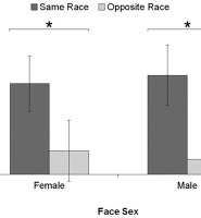
막대그래프(bar chart) & 오차 막대그래프
chick.bar <- ggplot(chick.f, aes(film, arousal))
chick.bar + stat_summary(fun = mean, geom = 'bar', fill = 'white', color = 'black') - bar graph는 평균으로 그려지는 모양으로, 평균을 개산할 stat함수를 사용해야함
-> stat_summary(fun(function) = 사용할 통계함수, geom = "기하 객체", color = 그래프 테두리 색)
-> 바 색상 변경 : + scale_fill_manual("Gender", values = c("Female" = "Blue", "Male" = "#336633")) #RRGGBB값
- 오차 막대그래프 *) fun.data : 자료 전체 대상, fun : 개별 자료 대상
#에러바 추가
chick.bar <- ggplot(chick.f, aes(film, arousal))
chick.bar + stat_summary(fun = mean, geom = 'bar',, fill = 'white', color = 'black')+
stat_summary(fun.data = mean_cl_normal, geom = 'pointrange')+
labs(x = "films", y = "mean arousal")
독립변수별 막대그래프
1) 색상분할
chick.bar <- ggplot(chick.f, aes(film, arousal, fill = gender))
chick.bar + stat_summary(fun = mean, geom = 'bar', position = 'dodge',color = 'pink')+
  stat_summary(fun.data = mean_cl_normal, geom = 'errorbar',
               color = "Red", position = position_dodge(width = 0.9), width = 0.2)+
  labs(x = "films", y = "mean arousal", fill = 'gender')
- dodge : 막대그래프가 곂치지 않고 나란히 배치
- position_dodge(width = 오차막대 사이의 거리), width = 오차막대의 넓이
2) 면분할(facet)
chick.bar <- ggplot(chick.f, aes(film, arousal, fill = film))
chick.bar + stat_summary(fun = mean, geom = 'bar', color = 'pink')+
stat_summary(fun.data = mean_cl_normal, geom = 'errorbar', width = 0.2)+
facet_wrap( ~ gender) + labs(x = "films", y = "mean arousal")+
theme(legend.position = "none")
선 그래프(line graph)
-개별점이 아닌 평균 등 요약점에 대한 선 그래프를 만들때는 미적속성 aes(group = 1)도 지정해야함
아래 여러개의 선 그래프를 만들때는 group = 여러개를 지정
hiccups <- stack(hiccup.data)
#changing to long-form
colnames(hiccups) <- c('hiccup.num', 'intervention')
hiccups$intervention.factor <- factor(hiccups$intervention,
levels(hiccups$intervention))
line <- ggplot(hiccups, aes(intervention.factor, hiccup.num))
line + stat_summary(fun = mean, geom = "line", aes(group = 1), linetype = "dashed") +
stat_summary(fun.data = mean_cl_boot, geom = "errorbar", width = 0.2) +
labs(x = "Intervention", y = "Mean Number of Hiccups")
독리변수 별 선 그래프
line <- ggplot(text.meg, aes(Time, Grammar_Score, color = Group))
line + stat_summary(fun = mean, geom = "line", aes(group = Group)) +
stat_summary(fun.data = mean_cl_boot, geom = "errorbar", width = 0.2) +
labs(x = "Time", y = "Mean Grammar Score", color = "Group")- 여기서 Group은 'text group', 'control group'을 가진 변수이다.
Theme and Options
-ggplot의 기본 테마: theme_gray(), theeme_bw()
- 추가 테마 : 제목 정의, 속성(크기/글꼴/색상 등)설정, 축/격자선/배경패털/텍스트 변경
element_text(텍스트), element_line(격자선/축 포함), element_rect(직사각형)
참고: https://m.blog.naver.com/PostView.naver?isHttpsRedirect=true&blogId=coder1252&logNo=221013962208
출처 및 참고 : '앤디 필드의 유쾌한 R 통계학'
'통계' 카테고리의 다른 글
| [가정] 모수적 검정 - 2) 분산의 동질성(homogeneity of variance) (0) | 2022.01.14 |
|---|---|
| [가정] 모수적 검정- 1) 정규성(normality) (0) | 2022.01.14 |
| R- Rstudio in Mas OC (0) | 2022.01.03 |
| 추론통계(Inferential statistics) : 2) 통계모형과 가설검정 (0) | 2021.12.30 |
| 추론통계(Inferential statistics) : 1) 확률과 모집단 추정 (0) | 2021.12.28 |